My Verizon App
Revising the information architecture and updating the navigational UI for the My Verizon App.
INFORMATION ARCHITECTURE / UX DESIGN
The My Verizon app is one of the most downloaded utility apps in America. Every month, 12 million people use the My Verizon App to manage all aspects of their wireless account, including paying their bill, changing their plan, upgrading devices, shopping, and redeeming rewards. Yet the app’s robust functionality was often hindered by its unintuitive information architecture, which made it difficult for customers to complete important account management tasks like changing their plan. The VP of Digital Experience at Verizon approached our team and asked us to redesign the information architecture of the app to resolve navigational issues that users were experiencing.
Overview
Goals
User experience goals
-
Reduce time on task
-
Reduce taps to complete task
-
Reduce pages visited
Business goals
-
Reduce customer call volume
-
Increase in-app transactions
-
Accommodate new and upcoming functionality
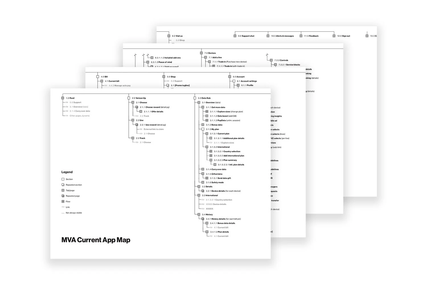
Our first step was to understand the app, as our team was new to Verizon, so we audited every page we could find and mapped out the app’s entire information architecture for our reference.
Mapping the app
Discovery testing
Our next step was to understand the exact problems that users faced when using the My Verizon app. We worked with partners in Verizon’s UX research division to administer a series of tests with current Verizon customers to determine where users were having issues with the app. In collaboration with our research partners, we fielded:
-
6 moderated task-based usability tests using 15 key tasks
-
6 moderated card sorts
-
54 unmoderated card sorts
-
50 unmoderated tree tests
For the moderated task-based usability tests, we tested 15 key tasks, which we identified through an analysis of business metrics and discussions with business stakeholders. Collectively, these research sessions revealed a few key problems with the app’s navigational structure.

1. Fragmented account management
Participants were confused about where to complete key account management tasks that they thought could reasonably live in multiple sections (“Data Hub,” “Devices,” or “Account”). When users couldn’t complete these tasks, they called customer service.

2. Inefficient and disorienting hamburger UI
The hamburger menu required multiple taps for users to complete key transactions and did a poor job of orienting users within the app. After users navigated a few levels deep into the app, they often wouldn’t remember which section they were in.

3. Not scalable for future functionality
The app’s information architecture didn’t thoughtfully account for upcoming functionality related to 5G – a major new initiative for the company.
Using the findings from our initial testing as thought-starters, we held a workshop with our business stakeholders to help generate potential solutions to the navigational problems we identified. In the workshop, we presented stakeholders with different scenarios that Verizon customers might encounter on the app — such as upgrading a phone or adding an international plan.
Concept design & testing
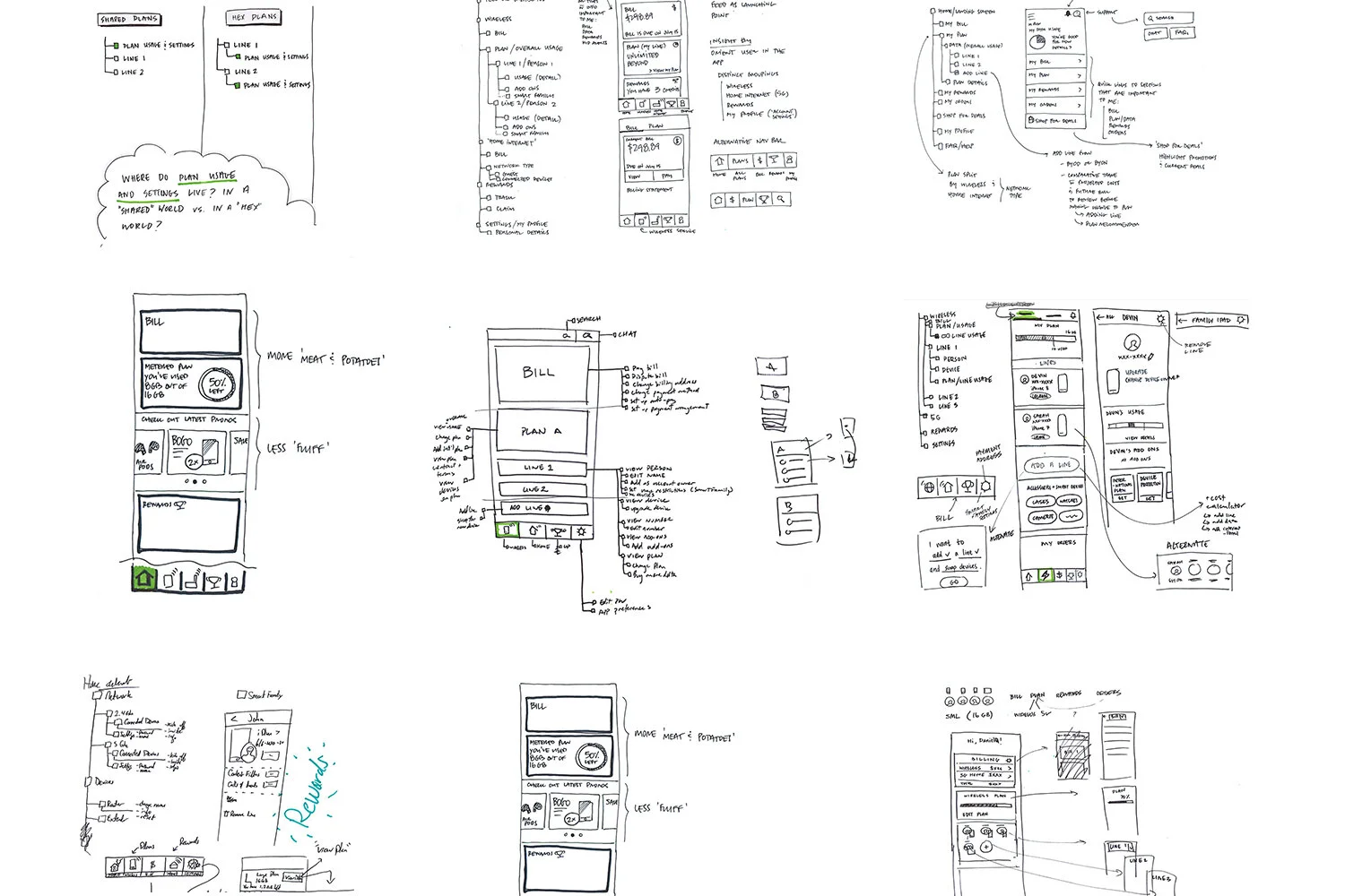
Based on the rough sketches that came out of our workshop session, we designed three divergent concepts, each with a different navigational UI and information architecture, which we planned to test with users.
CONCEPT 1
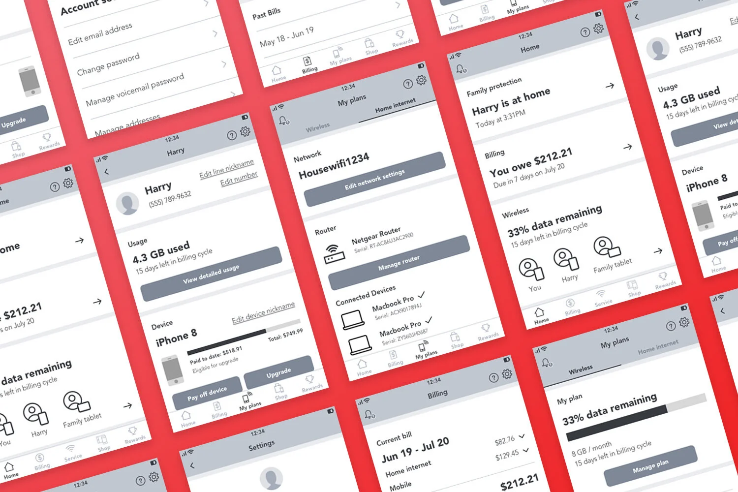
Tab Bar
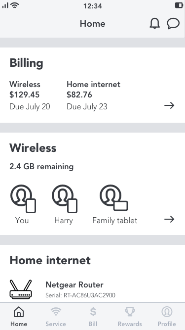
All sections are available from persistent bottom tab bar navigation. All account management for wireless and home internet is consolidated into a single section called “Service.”
CONCEPT 2
Hamburger
Uses the current hamburger menu navigation model and separates mobile and home internet account management in different sections.
CONCEPT 3
View & Do
Access different sections by swiping left or right, in the style of apps like Snapchat. Actions in each section are only available via tapping on floating action button. Shop has no dedicated section and is embedded throughout experience.
In addition to different navigational models, each concept also had slightly different information architecture.

To test our concepts, our research lead facilitated seven 90-minute moderated interviews with a mixture of Verizon and non-Verizon customers, in which he asked them to complete the same 15 key tasks that we had tested in our initial round of research. Our goal was to understand:
-
Which interaction pattern was easiest for customers to use and understand?
-
Which information architecture was easiest for customers to use and understand? And specifically: do customers prefer Mobile and Home Internet as separate sections or as a single, combined section?
Concept testing findings
The majority of users completed tasks faster and easier using the Tab Bar concept. Most users also rated it as their favorite concept because they could see each section, easily understand the contents of the app, and complete tasks with fewer clicks.
Based on these results, we decided to further refine the Tab Bar concept based on a few issues problems that users encountered with it during the first round of test:
-
Some participants were unable to complete the “Add Travel Pass” and “Add TMP” tasks because they didn’t know what content they would find in the “Add-Ons” section.
-
Some participants were unable to update their credit card because they looked for this information in the “Profile” section, rather than the “Billing” section
-
Some participants wanted to be able to access all support content from the same place.
We refined our design to address these issues through a few targeted design changes:

Displaying the categories of available add-ons in the “Service” screen so that users know what they could find in the “Add-Ons” section.

Including “manage payment methods” in the “Profile” section as well as the “Billing” section to help users change their credit card information.
Concept refinement & retesting
After we implemented our design tweaks to the Tab Bar concept, we created three variations of the sections that would appear in the tab bar and tested those variations with a mixture of Verizon and non-Verizon customers. Our research partner again facilitated seven 90-minute in-person sessions using the same 15 key tasks as before. Our goal was to:
-
Determine which sections should live in the bottom tabs (as primary navigation items) or in the header (as secondary navigation items).
-
Understand if our design updates resolved user issues from the first round of testing around:
-
Viewing and browsing add-ons
-
Managing devices
-
Managing payment information
-
Locating support channels
-
During each session, participants were asked to complete all tasks using a prototype of one of the options. Then, we showed them the two other options and discussed which they preferred.

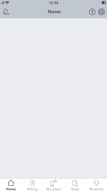
NAVIGATION OPTION A
Header: Alerts, Rewards, Profile
Tab bar: Home, Billing, Service, Shop, Support
NAVIGATION OPTION B
Header: Chat, Rewards, Profile (with alerts accessible inside of it)
Tab Bar: Home, Billing, My Plans (same as Service, but different name), Shop, Support

NAVIGATION OPTION C
Header: Alerts, Support, Profile
Tab bar: Home, Billing, Account (same as Service, but different name), Shop, Rewards
Results
Our updated navigation design did effectively reduce participant problems from the previous round related to viewing and browsing add-ons, managing payment information, and locating a store. However, we also encountered some additional problems that we needed to address:
-
Including “Support” as a bottom tab made some customers go there to troubleshoot their lines, instead of going to the “Service/Account” section.
-
The icon used for “Profile” made some single-line participants go there to manage their line, instead of going to the “Service/Account” section.
-
Most participants preferred “Alerts” separate from “Profile.”
We refined our design to address these issues by:
-
Making “Support” a header item to reduce the probability that customers would mistakenly go there to troubleshoot their lines, instead of going to the “Service/Account” section.
-
Renaming “Profile” as “Settings” and using the gear icon to reduce the probability that single-line customers would mistakenly go there to manage their line, instead of going to the “Service/Account” section.
-
Separating “Alerts” from “Settings” to match users’ preferences.
Icon and nomenclature testing
Participants gave us feedback about iconography and nomenclature in our first few rounds of research, but it was difficult to test those aspects of our design within the context of usability testing, and we had some outstanding questions about which icons would be most effective in the navigation UI.
To answer this question, we worked with our research partners to set up two separate quantitative tests of the icons and nomenclature in our updated navigation system. We wanted to find out what information users would expect to find in each section of the app based on its name and icon, so we could be sure our system was as comprehensible as possible.
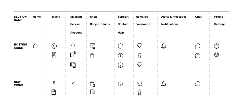
Icon study
For the icon study, our researcher set up a remote, unmoderated study with 120 participants, both Verizon and non-Verizon customers. The testing stimulus included eight sets of icons, some of which we pulled from the Verizon brand directory, and some of which we created ourselves.
Users were asked to describe what they would expect to be able to do in a section represented by each icon. They were then asked to select which icon they preferred based on the expected tasks they described being able to complete in that section. And finally, they were asked to name the section that the icon would represent. The results showed a clear preference for certain icons and names:
Naming study
For the naming study, our researcher set up a remote, unmoderated study with 120 participants, both Verizon and non-Verizon customers. Participants were asked which name makes the most sense for a section of the app that combined wireless cellular management and home internet/Wi-Fi management.
Out of the three options (“My Plans,” “Service,” and “Account”), “My Plans” was the clear winner.
Final refinements
With several rounds of usability testing and the icon and nomenclature study behind us, we felt confident in making a final recommendation for the sections, icons, and names that should appear in the updated navigation.
We also refined the information architecture for our final recommendation to make sure that we had accounted for every existing page and section.
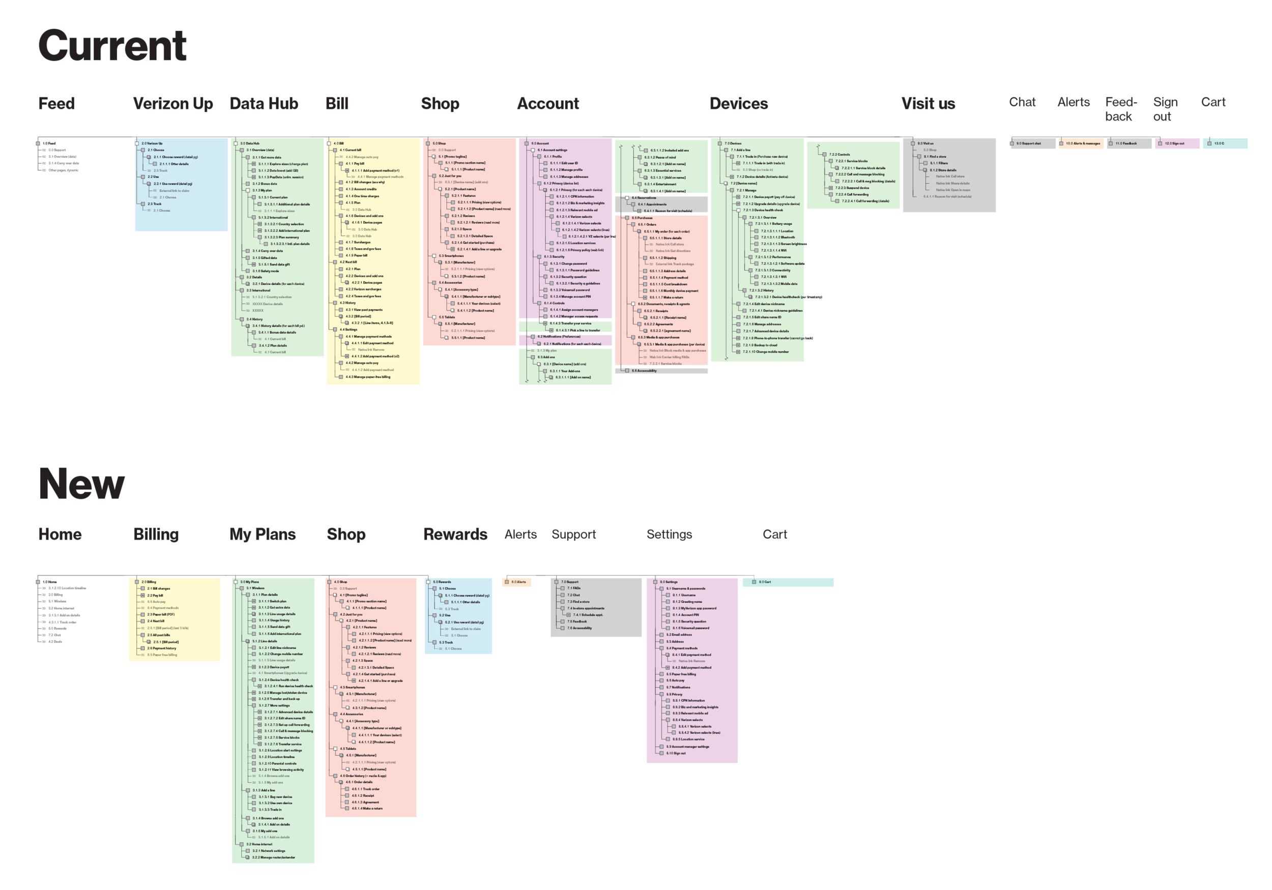
Some of the major IA changes included:
-
Combining “Data Hub,” “Devices,” and “Add Ons” (from “Account”) to form “My Plans”
-
Combining “Visit Us,” “Feedback,” and “Chat” into a single section called “Support”
-
Moving “Orders & purchases” from “Account” to “Shop”
-
Making what’s left of “Account settings” into its own “Settings” section
-
Renaming “Verizon Up” as “Rewards”
-
Consolidating page in the “Bill” section
-
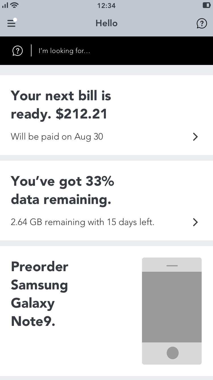
Redesigning the “Feed” and renaming it “Home”
Using a simplified version of the app map, you can see how the account management functionality (in green) that was formerly spread out across multiple sections of the app gets consolidated in our recommendation
A/B Testing
We felt confident in our recommendation, but we wanted to make sure our updated app design was an improvement to the current app, so we tested our updated design against the current app in a head-to-head study.
Our research partner recruited 35 Verizon customers and 25 non-Verizon customers across a mixture of incomes, ages, ethnicities, genders, and app familiarity. Those customers received a link on their phones to either of two wireframe prototypes – one of our new design, and one that exactly mirrored the current app. Of the 60 participants, half were given the new design and half were given the current design. Then, participants were asked to complete the same 15 tasks that we tested with users in all previous rounds of usability testing.

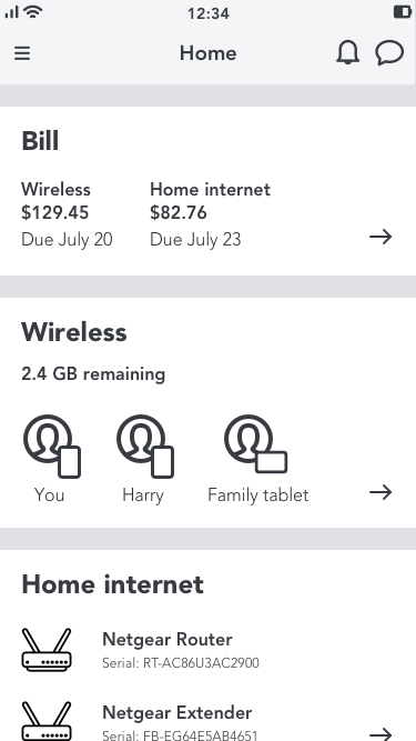
Our new updated design
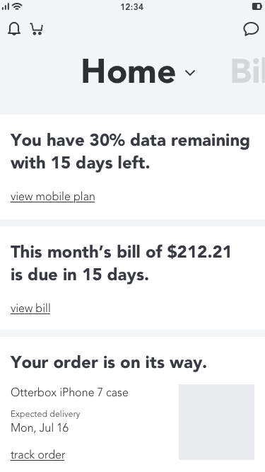
The current design
Results
The new design significantly outperformed the current design statistically
Participants successfully completed more tasks in significantly less time and with fewer taps using our new design.
Participants felt that the new design was easier to use
33% of participants who used the new design felt that all tasks were easy to complete, compared to only 7% who used the current app.
Participants vastly preferred our new design
43% of participants rated the new design 5/5 in overall satisfaction, compared to only 17% for BAU design. Additionally, no participants gave negative ratings (1/5 or 2/5) to the new design, compared to 7% of participants who rated BAU negatively.
Financial Impact
The huge user base of the My Verizon app means that even small design changes can have huge financial impacts. Based on previous business metrics, a 1% yearly increase in key interactions would result in about $2.1M in annual earnings.
With the support of a member of the digital operations team, we calculated that our updated design would result in an estimated cost savings of $2.8 million per year based on decreased call-in-rate and increased self-service transactions.
Making it real
After our final round of testing, we met with business stakeholders to present our work and determine how to move forward with our proposed solution. Taking into consideration the available development resources and other business priorities for the rest of the year, we proposed implementing our recommendation through a series of phases.
The first phase would involve consolidating account management into a single section named “My Plans,” but doing so within the current Hamburger navigation UI. This approach would allow us to still make the most high-impact change to the app’s IA, but we would do so safely, and within the framework of its existing navigation UI. Unfortunately, I was soon pulled onto another project that needed design assistance, however I still got to watch as my other teammates brought this project to life in the next phase of work.